
Viby’Z
One look for going out: from the first search to the ticket at the door.
Client projectviby-z.com (opens the live site in a new tab)
Let’s vibe together
Viby’Z is a French platform for finding events nearby, booking a place and going with friends: concerts, stand-up, parties, talks. Flexminde designed its interface across three surfaces — the website, the dashboard and the mobile app — for another team to build.
Viby’Z in numbers
- 3surfaces designed: website, dashboard, appFlexminde design files
- 6web pages, from home page to ticket walletFlexminde design files
- 2themes for the app’s onboarding, light and darkFlexminde design files
Flexminde designed these interfaces and did not build or run them, so there are no traffic or booking figures here. These are facts about the design work, and the website it became is live at viby-z.com.
The brief and what came of it
The Problem
An events platform lives or dies in a few moments: seeing something worth going to, trusting the page enough to pay, and finding the ticket again at the door. Viby’Z needed those moments designed as one product, on a desktop site and in an app, before development started.
The Solution
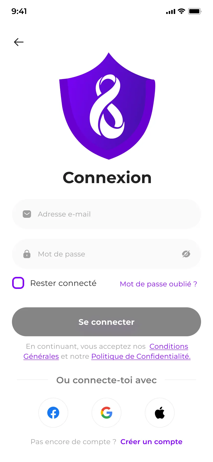
Flexminde designed the website page by page — a home page led by a large event slider with the date, time and starting price set big beside it, category rails, event cards, a sign-in modal, checkout and a ticket wallet with QR codes — around a single violet and the infinity mark. For the app, Flexminde designed the splash, onboarding and sign-in screens in light and dark, and adapted the remaining screens from a commercial UI kit, restyled and written in French for Viby’Z.
The Outcome
The designs went to the development team, who built the platform. The website at viby-z.com follows the design closely: the top bar, the search pill, the category strip, the slider with its date block and the event rails are where the design put them.
Designed around the night out
Most visits to an events site are short and specific: what is on, when, how much, and can I go. The design puts those answers first, and leaves the rest one tap away.
Date, time, price up front
The home slider sets the day, the time and the starting price in heavy type under each featured event, so the decision can be made before the event page opens.
Rails by category
Events are grouped into horizontal rails with a “Voir tous” link each, and every card carries the same facts in the same order: category, title, date, time, venue, price.
Pay without leaving the order
Checkout keeps the order, personal details, summary and payment on one page, with card and CMI payment side by side.
The ticket is the page
The ticket wallet shows each ticket with its QR code, number, type and venue, with sharing and inviting friends built in, and splits active, past and cancelled tickets into tabs.
What it looks like
Flexminde’s design files, with the placeholder copy the designs were delivered with. The app screens on the last plate were adapted from a commercial UI kit. Open viby-z.com to see the website as another team built it.
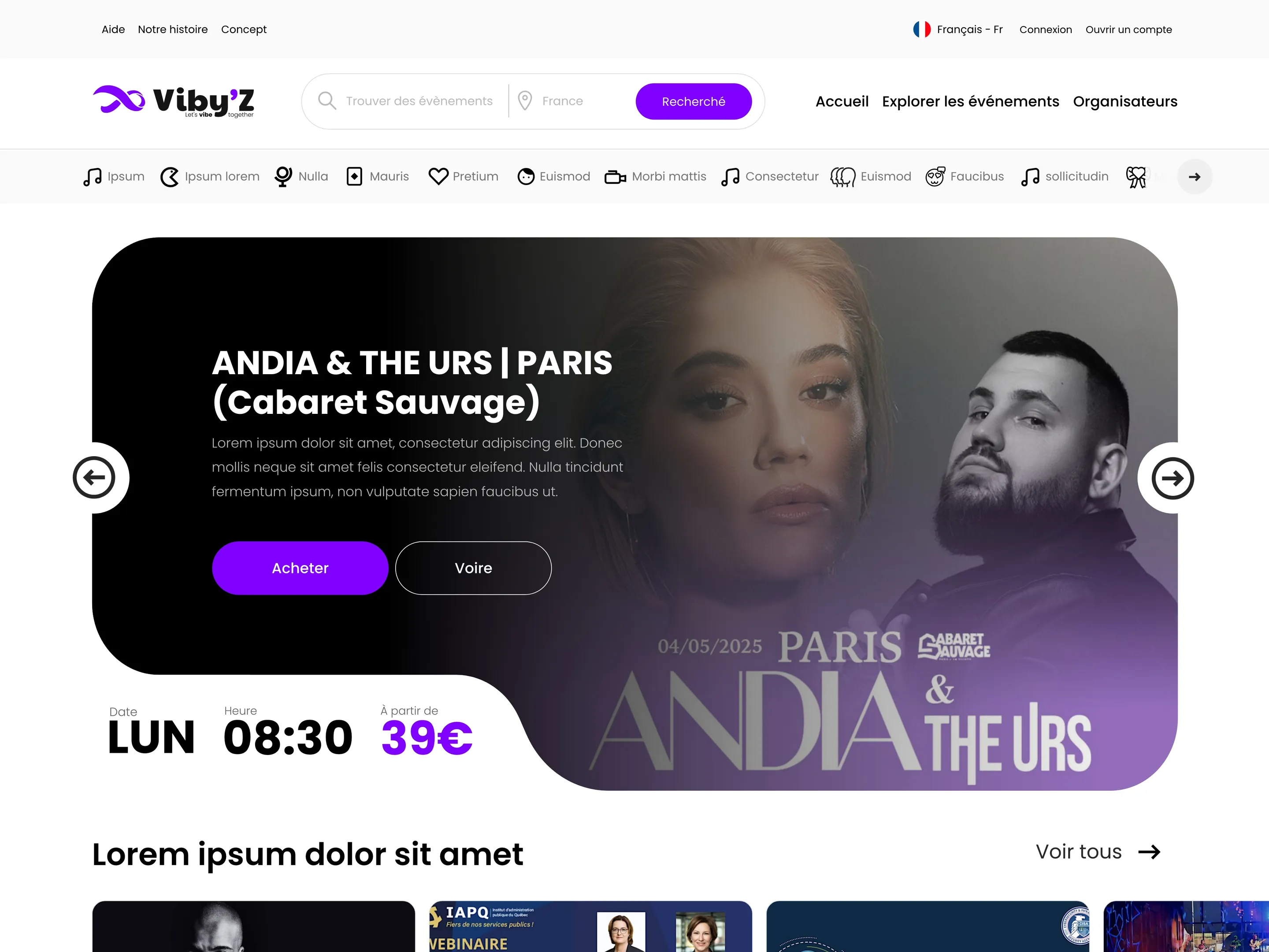
Home page — design file 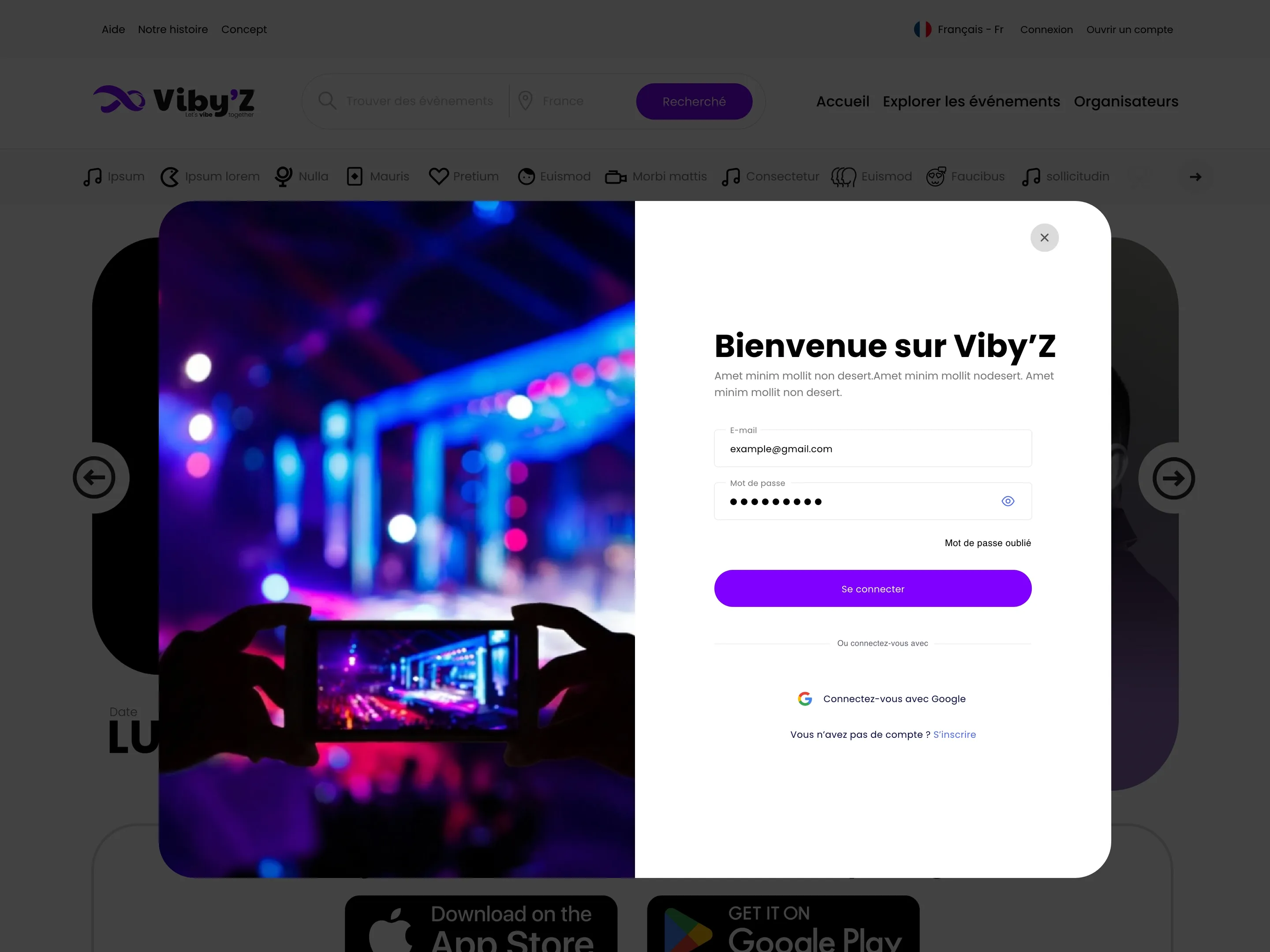
Sign-in modal — design file 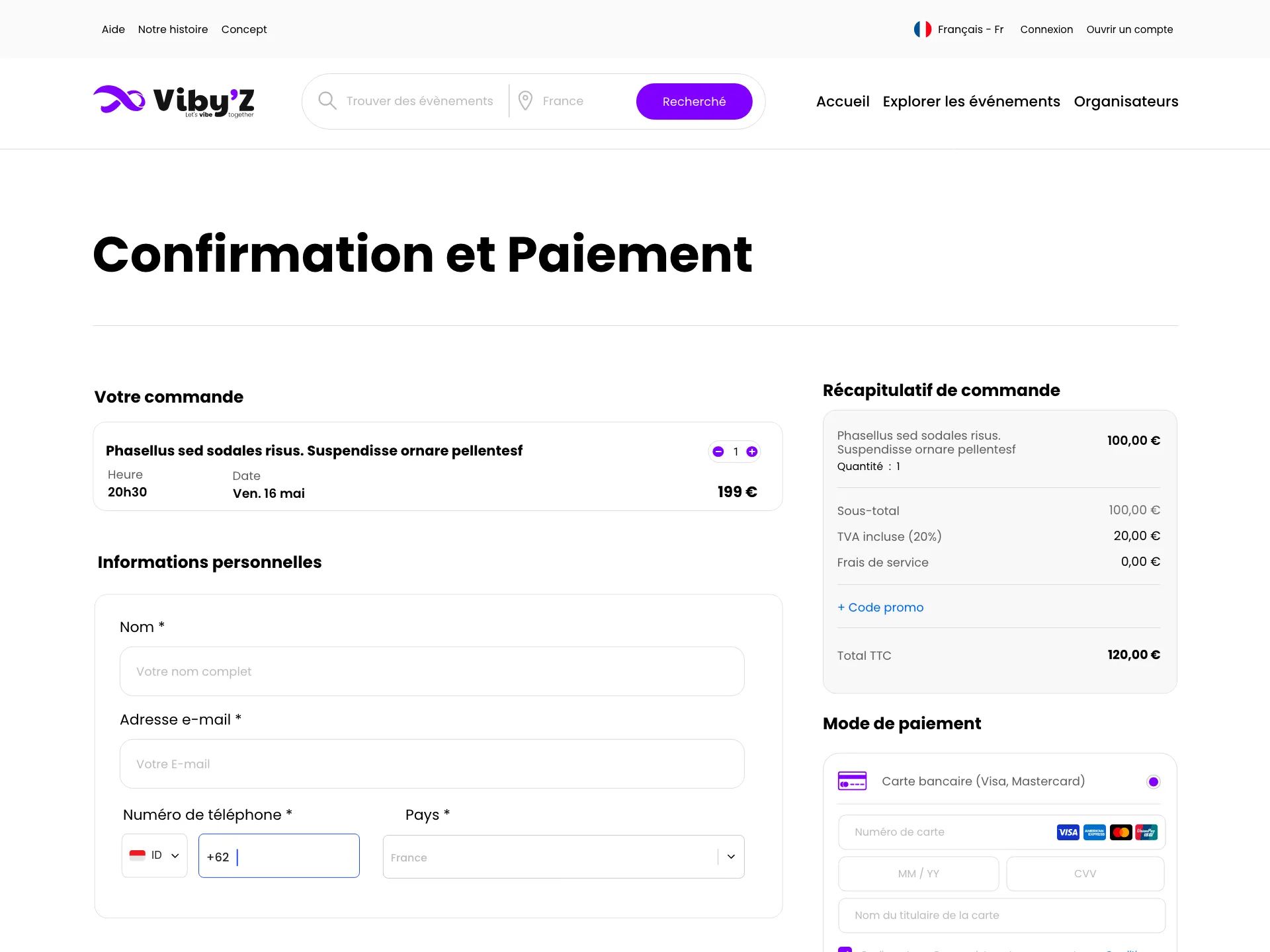
Checkout — design file 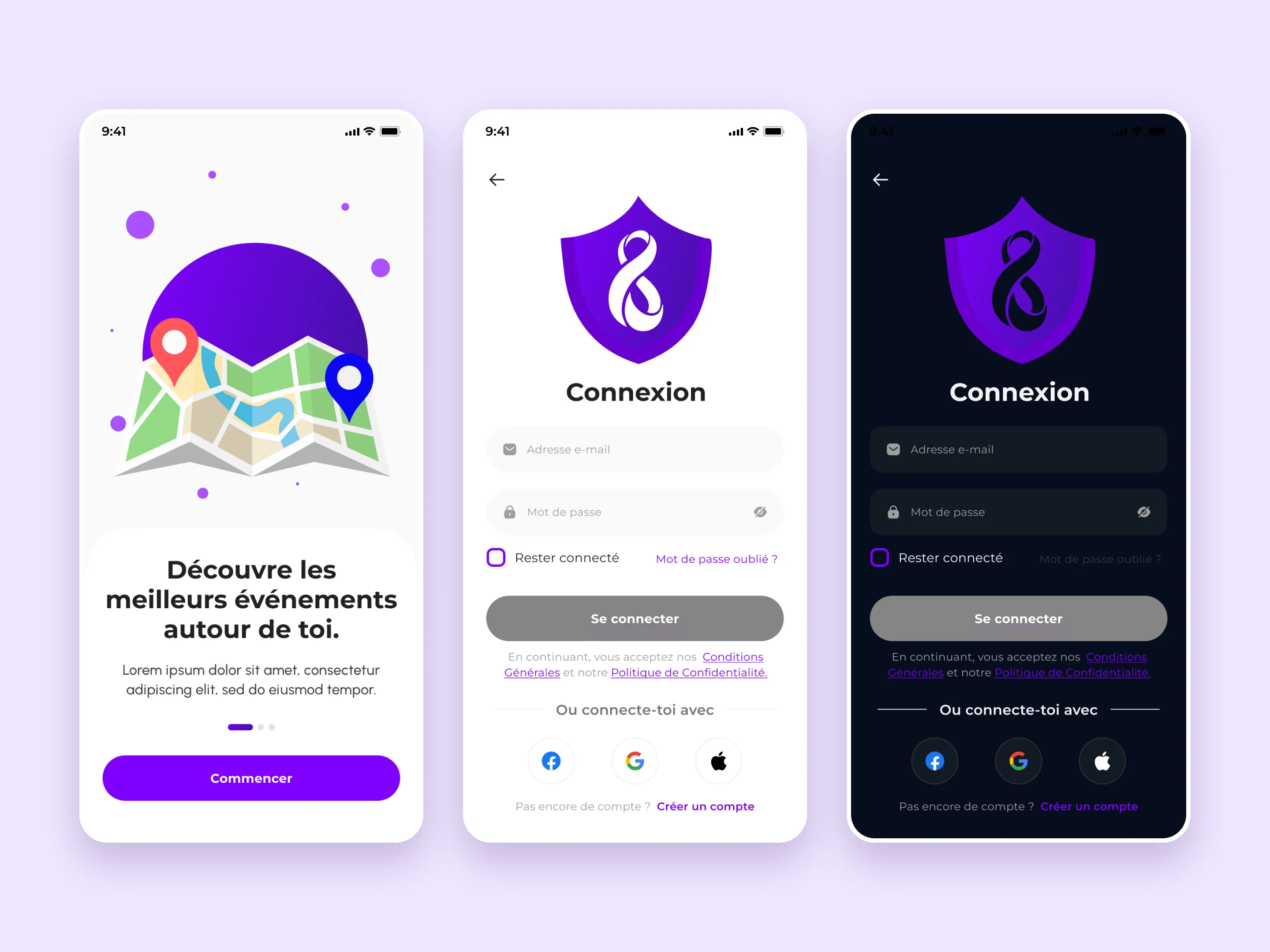
App onboarding and sign-in, light and dark — designed by Flexminde 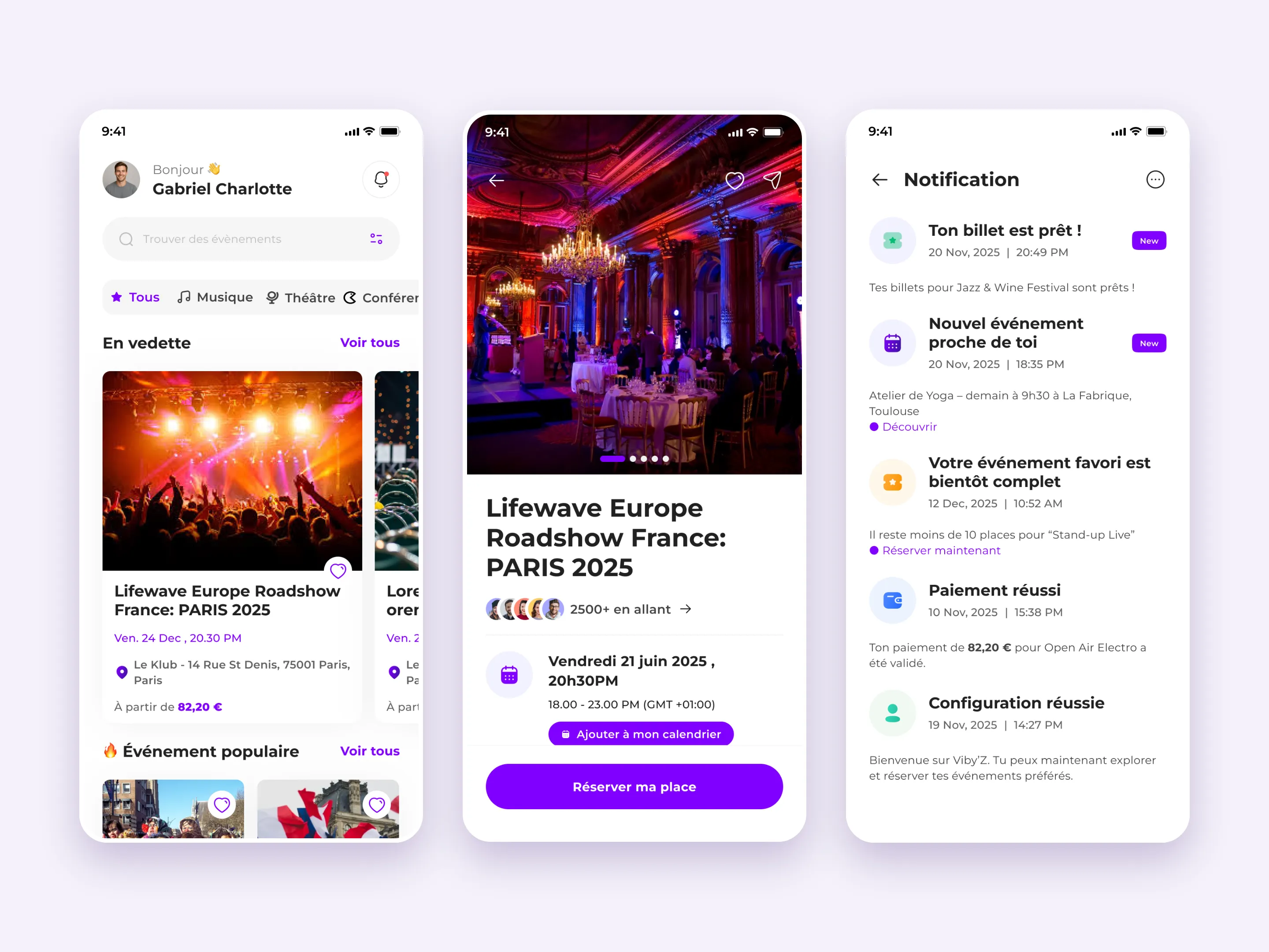
App home, event and notifications — adapted from a UI kit
One system, three surfaces
The website, the dashboard and the app share one violet, one mark and one way of writing an event: category, title, date, time, venue, price.
- #7F00FFthe brand violet, on every surfacePrimary
- 2light and dark onboardingApp themes
- FRFrench-first interface copyLanguage
Design, handed over
Flexminde’s part was the interface. The website was designed as full desktop pages: the home page, the brand story page, the sign-in modal, checkout, and the ticket pages, with the header, search and footer shared across all of them.
For the mobile app, the splash, onboarding and sign-in screens were designed from scratch, in light and in dark. The rest of the app — home feed, event pages, booking, tickets, favourites, notifications, messages and settings — was adapted from a commercial event-app UI kit: restyled to the Viby’Z violet and mark, and written in French.
The dashboard was designed alongside them. Development was done by another team, who built the website now live at viby-z.com; the Viby’Z Android app is listed on Google Play.
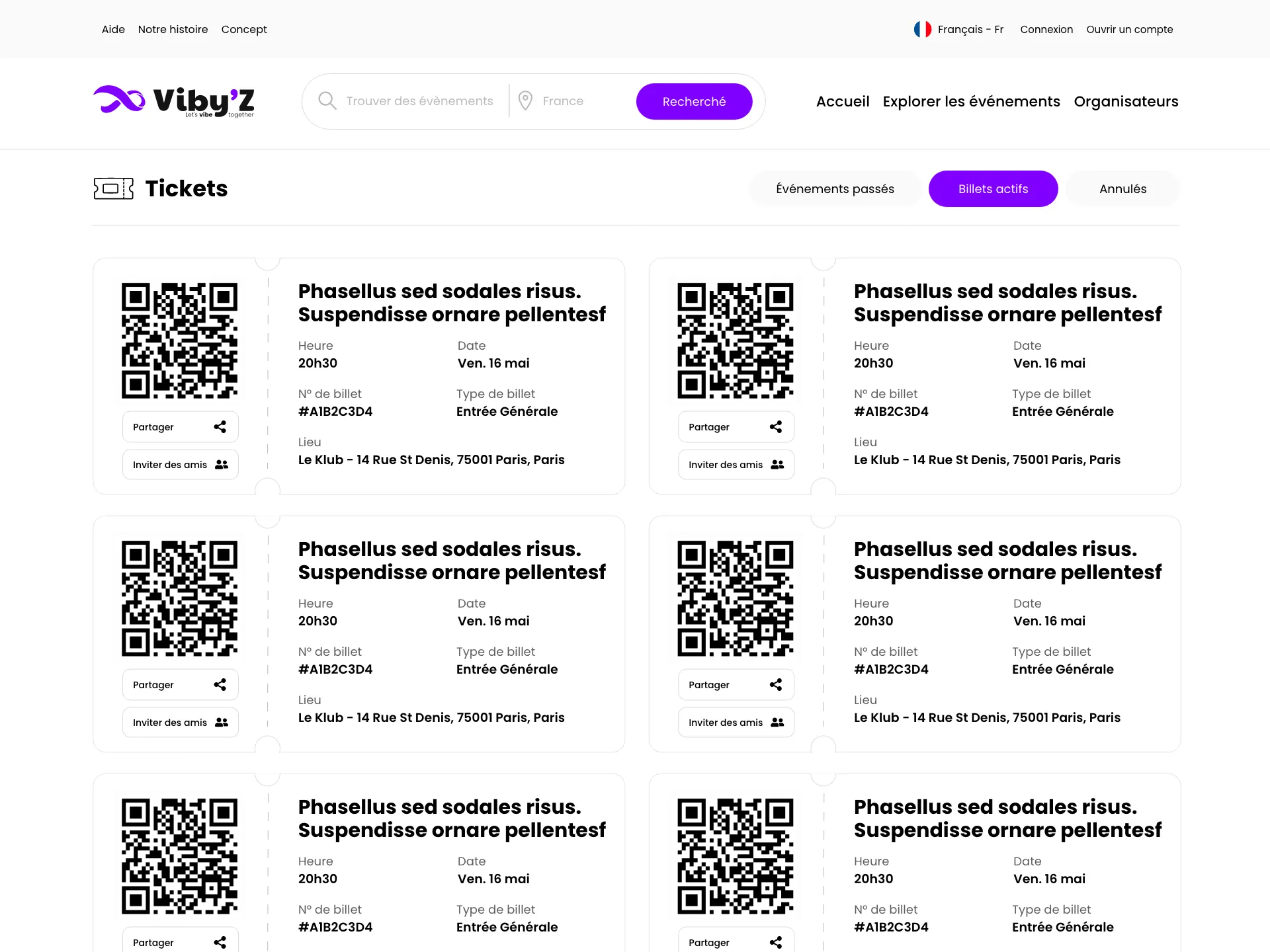
Find it. Book it. Show the QR code at the door.
How the work ran
In this order, and no stage started before the one before it had produced something the client had seen.
Website design
The home page, event rails, brand story page and the shared header, search and footer, around the violet and the infinity mark.
Booking and account flows
The sign-in modal, checkout with card and CMI payment, and the ticket wallet with QR codes.
App onboarding and sign-in
Splash, three onboarding screens and the sign-in screens, designed from scratch in light and dark.
App screens from a UI kit
The remaining app screens adapted from a commercial event-app UI kit, restyled and written in French for Viby’Z.
Dashboard design
The dashboard interface, in the same system as the website and the app.
Handover
The design files went to the development team, who built the platform.
The services behind Viby’Z
The same work is available on its own. These are the parts of it this project actually used.
Viby’Z questions
What people ask about this project once they have seen the numbers. If yours is not here, ask it on a first call.
Did Flexminde build the Viby’Z website or app?
No. Flexminde designed the interfaces. Another team built the website and the app from those designs.
Was every app screen designed from scratch?
No. The splash, onboarding and sign-in screens were. The rest of the app was adapted from a commercial event-app UI kit, restyled to the Viby’Z brand and written in French.
Why do some screens show placeholder text?
They are the design files as delivered, with placeholder copy where the real content would go. The live site shows the same layouts with real events in them.
Your project could be the next one here.
Tell us what you are building and what already exists. You get a straight answer on whether it is a fit, and a written scope before anything starts.
- Senior-led from first call to launch
- Written scope before any build starts
- Built to WCAG 2.2 AA and tested
- No quote until you are ready