
Goud
A red bar, a black menu, and the news in the language people speak.
Partner project with Youniwemigoud.ma (opens the live site in a new tab)
Morocco, without the frills
Goud is an Arabic-language Moroccan news site that writes its headlines in Darija, the Arabic Moroccans speak every day. Its logo carries the promise “المغرب بلا زواق، ديما نيشان” — Morocco without the frills, always straight to the point. Flexminde designed its current interface and integrated it in HTML and CSS, in partnership with Youniwemi.
Goud in numbers
- #4news & media site in MoroccoSimilarweb category rank, August 2026
- #62of all websites in MoroccoSimilarweb country rank, August 2026
- 2mobile themes, light and darkLive site, September 2026
The rankings are Similarweb’s third-party estimates for August 2026. They describe the audience this front end serves, not a result of the work: Goud had its readers before the redesign.
The brief and what came of it
The Problem
Goud’s voice is its own: short, sharp, in Darija. Its front end ran on a single red bar with the menu squeezed in beside the logo, and a news site publishing all day needed a layout that could give each section room, carry that voice, and work on a phone at night as well as by day.
The Solution
A new interface, designed with Youniwemi and integrated by Flexminde in HTML and CSS, right to left. The red bar keeps the logo and the social links; a black menu bar under it carries the sections. The home page is a set of named bands — a lead slider, videos, تبركيك, and a dark band for the latest stories — and on mobile the same content becomes rounded cards, with a switch between light and dark.
The Outcome
The design is what goud.ma runs today: the red and black bars, the lead slider, the video row, the تبركيك block and the dark آخر ما كاين band are all where the design put them, and the site ranks fourth among Morocco’s news publishers in Similarweb’s estimates.
A front page with a voice
A news home page has to be scanned in seconds. The design gives each of Goud’s sections a band of its own, so the tone changes as you scroll without the layout changing under you.
Two bars, two jobs
The red bar is the brand: logo, social links. The black bar is navigation: الأولى, آش واقع, آراء, تبركيك and the rest. Keeping them apart lets the menu grow without crowding the logo.
Bands, not boxes
Videos, تبركيك, opinion and the other sections each get a full-width band with its own heading and “more” link, instead of a column of widgets competing for attention.
The latest, in the dark
آخر ما كاين (the latest) sits on a black band halfway down the page, so the newest stories stand out from the sections around them.
Light and dark on the phone
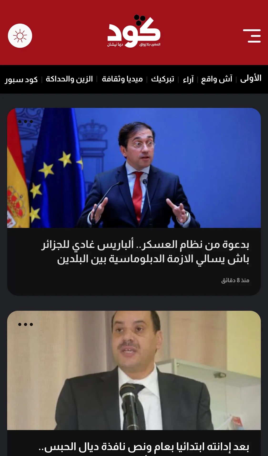
On mobile, stories become rounded cards under a compact header, and a moon or sun switch in the red bar flips the whole site between light and dark.
What it looks like
The home, article and mobile screens are Flexminde’s design files, with the stories and ad placements they were designed with. The second is the live site in September 2026, with ad slots hidden so the layout shows. Open it yourself and compare.
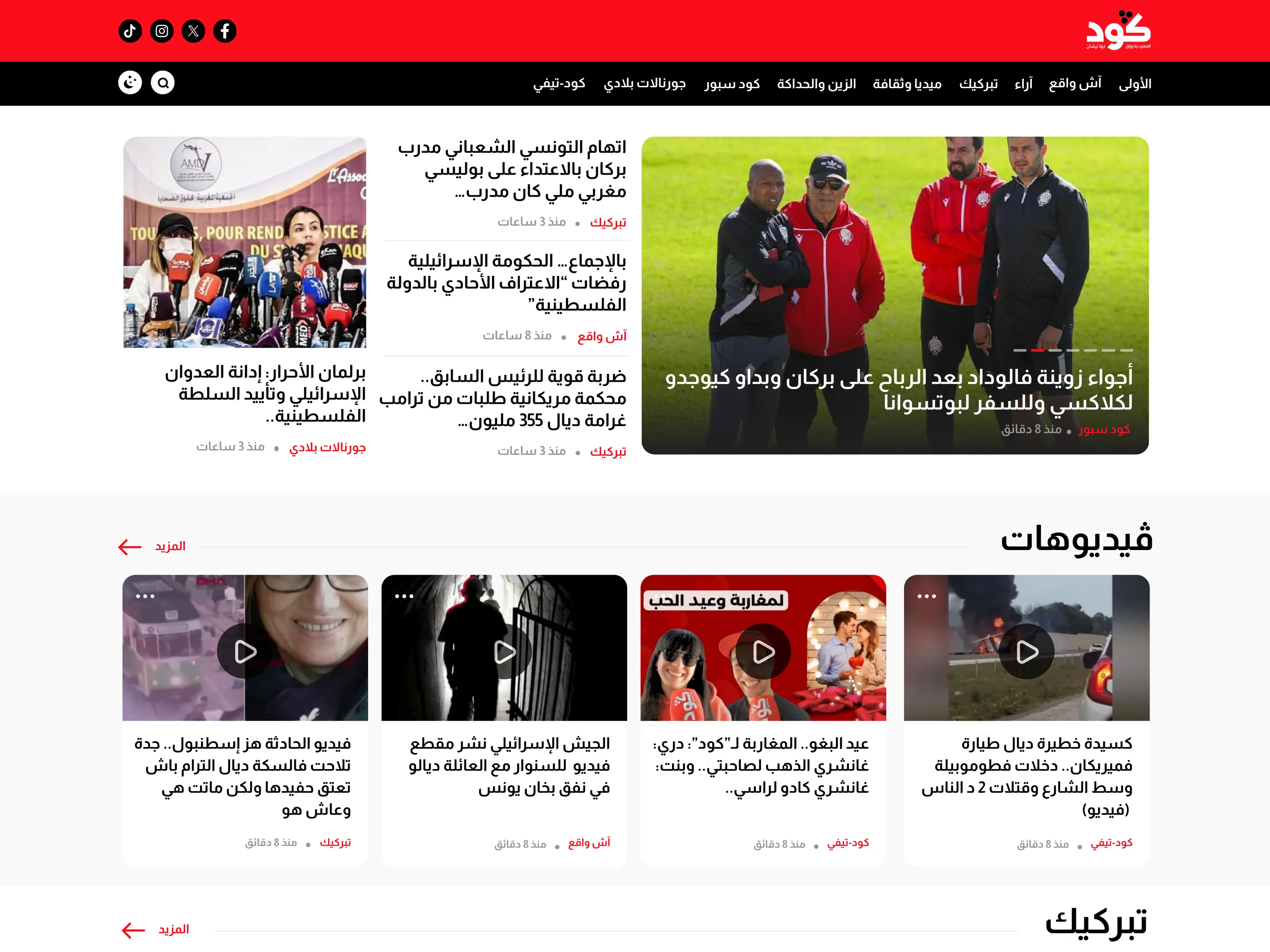
Home page — design file 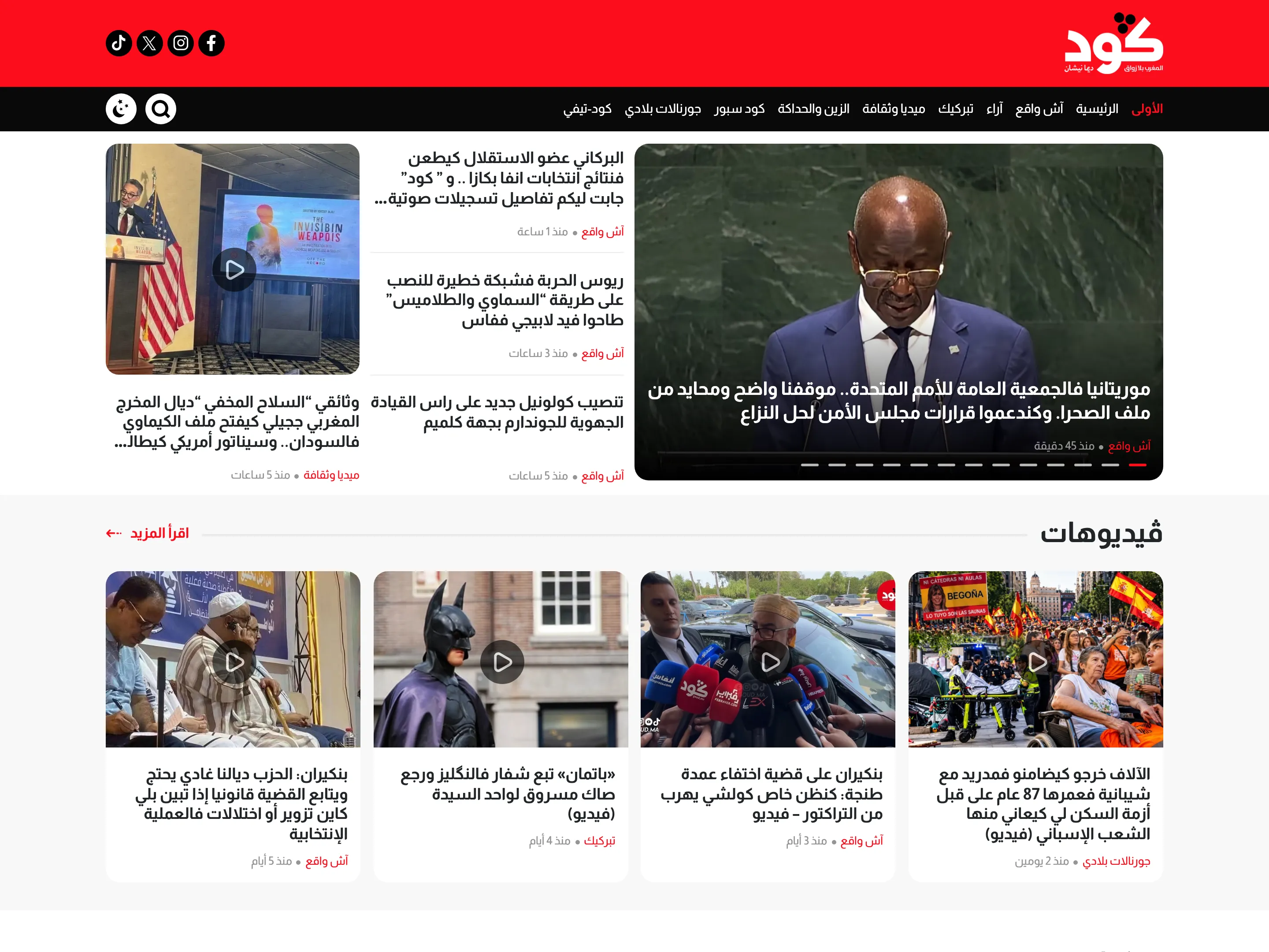
Home page — live site, September 2026, ad slots hidden 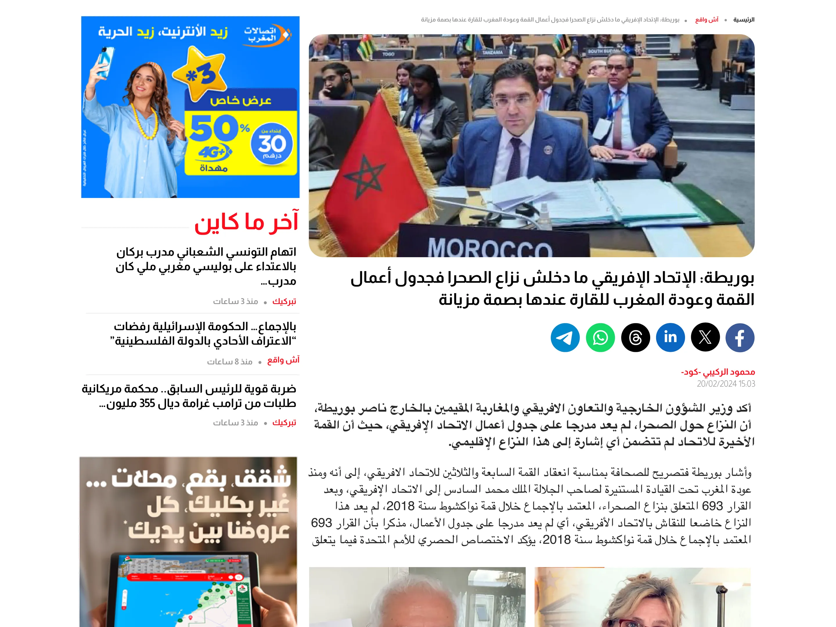
Article page — design file 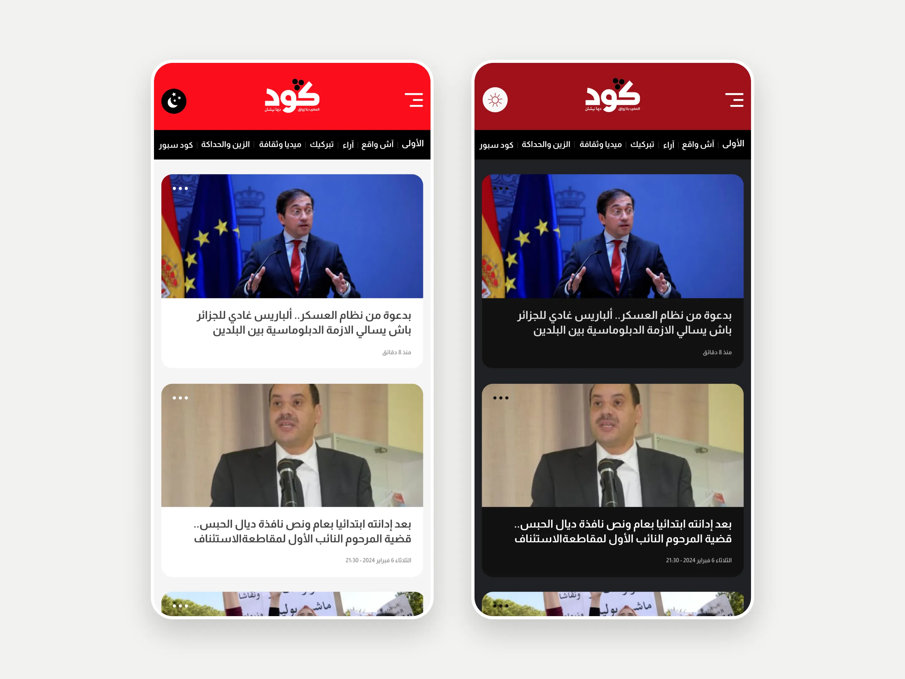
Mobile home, light and dark — design file
Built right to left
Every template was integrated for Arabic from the first line: menus, slider, grids, share bars and timestamps read right to left, in both themes.
- RTLArabic, right to leftDirection
- 2light and darkThemes
- HTMLand CSS, for a custom WordPress themeIntegration
From design file to front end
Flexminde’s part was the interface and its integration. The designs covered the home page, the article page and the mobile home in light and dark, and Flexminde then turned them into the site’s HTML and CSS.
All of it is right to left. The black menu bar, the lead slider, the section bands, the share bar with Telegram, WhatsApp, Threads, LinkedIn, X and Facebook, and the timestamps were built for Arabic from the start, not mirrored afterwards.
The work ran in partnership with Youniwemi. The integrated templates went into the custom WordPress theme the site runs on.
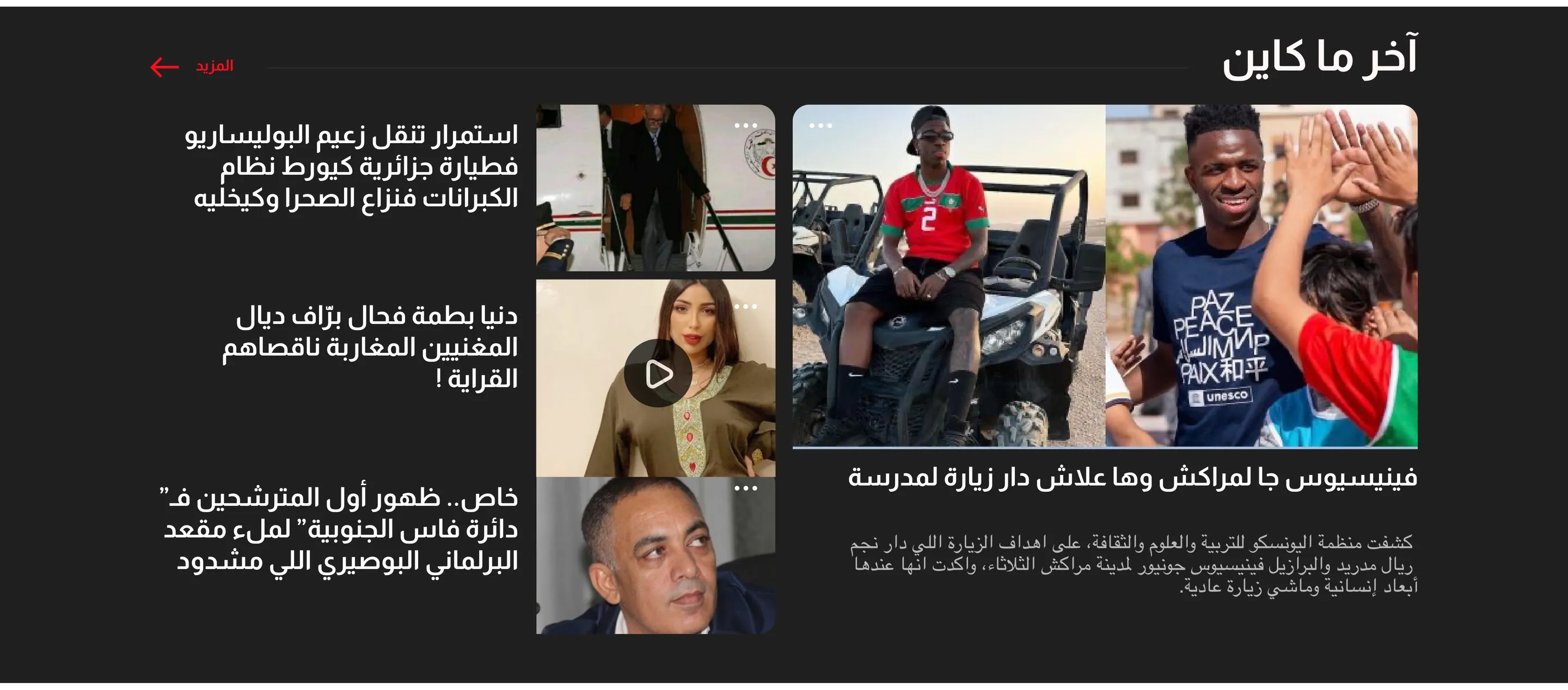
The latest, in black. Everything else, in its own band.
How the work ran
In this order, and no stage started before the one before it had produced something the client had seen.
Interface design
Working with Youniwemi on the home page, the section bands and the article page, around the red and black bars.
Mobile, light and dark
The mobile home page as rounded story cards, designed in a light and a dark theme.
HTML and CSS integration
Every template turned into production HTML and CSS, right to left, in both themes.
Into WordPress
The integrated templates went into the custom WordPress theme the site runs on.
The services behind Goud
The same work is available on its own. These are the parts of it this project actually used.
UI/UX Design
Web design and UI/UX for websites, dashboards and mobile apps. Delivered as a design system of tokens and components, built on real content and accessible from the start.
Web Development
Website creation and web development from a senior-led studio. WordPress, Next.js and Astro builds, with semantic markup, accessibility and performance handled while the site is being made.
Goud questions
What people ask about this project once they have seen the numbers. If yours is not here, ask it on a first call.
What did Flexminde do, and what did Youniwemi do?
Flexminde designed the interface and integrated it in HTML and CSS. The project ran in partnership with Youniwemi, and the site runs on a custom WordPress theme that this page does not claim.
Are the rankings Flexminde’s results?
No. They are Similarweb’s public estimates, and Goud had its readers before the redesign. They are here to show the scale the front end has to serve, not to claim the audience.
Why do the design files show ads?
Ads pay for the news, so the article page was designed with its ad placements in it. The live capture hides them so the layout is easier to see.
Your project could be the next one here.
Tell us what you are building and what already exists. You get a straight answer on whether it is a fit, and a written scope before anything starts.
- Senior-led from first call to launch
- Written scope before any build starts
- Built to WCAG 2.2 AA and tested
- No quote until you are ready